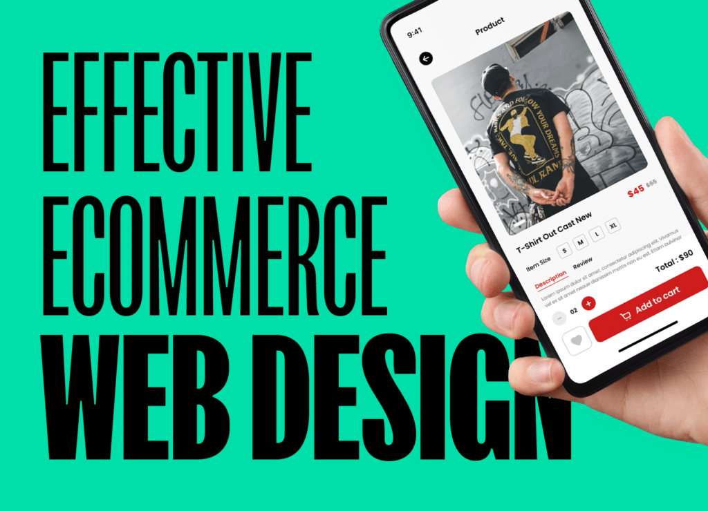
It is 2023 and by now the world of commerce has been through multiple transformations and the digital world has been a big part of it.
Whether you buy your groceries, clothes and presents online or have merely booked one session at your local spa years ago, chances are you’ve been exposed to the world of eCommerce in some shape or form. The convenience of browsing products, reading reviews, and comparing prices from the comfort of our homes has become an integral part of modern life.
But with such a broad landscape it is up to business owners and developers to deliver an optimal user experience and shape how people interact, make choices and ultimately influence perceptions and decisions to move them from consideration to sale.
While every website we build is unique, there are common elements and patterns we use across eCommerce sites that allow us to satisfy different user journeys. When visitors come to a website through an external source, such as Google, they may land on a category or listing page that doesn’t have a clear call to action, such as “add to cart”. This is why it’s important to consider user experience and provide guidance to users.
Here are some key recommendations for 3 key page types that are present on all eCommerce websites. Let’s dive in!
Effective homepage
While not all visitors arrive at the website’s homepage, many users do. They will arrive there via social media, business profiles, or traditional advertising. For that reason, it is essential to optimise this page and try to introduce the site and explain what the offer is. More importantly why and how it is different (and better) from competitors. An effective homepage should expose the primary product offering and quickly allow users to start shopping.
Similar to the front window of a store in a shopping centre, by looking at it people will be able to see the product offering and quickly make a decision about going in or moving to the next shop.
While this recommendation seems straightforward, a lot of businesses struggle with it and tend to clutter the homepage with products, news, categories, and useless content that doesn’t add any value to the shopping experience.
Clear product category pages
Website visitors have different needs and preferences. Product categorisation serves as a guiding map, allowing users to navigate the digital aisles with ease. By grouping items logically, whether by product type, brand, use case or relevant criteria the website will help users quickly narrow down the options and facilitate the path to conversion.
In fact, in many cases, a polyhierarchical structure could be the best approach. What this means is a navigation structure where an item exists in more than one place and can be reached following several category paths.
An excellent example of this is what we did recently for Spajar, where we created a second navigation structure allowing users to find the ideal product by either using traditional categories or based on their skin goals or concerns.
Product pages
At the heart of any eCommerce platform lies the hero: the product page. This one has the massive responsibility of addressing customers’ queries, shaping their perceptions, and guiding them toward a purchase decision. A well-designed product page can be compared to a skilled and knowledgeable salesperson who anticipates visitors’ needs and answers their questions.
A good product page goes beyond presenting a product, it creates an immersive experience that goes from basic information. It serves users who already know what they want, to deep details about how to use the product or service, technical information, customer reviews, frequently asked questions, and in some cases, related products, or alternatives (cross-sales or up-sales).
That being said, there is a fine line between including key details vs obscuring the path to purchase by offering too many options or fancy features. The importance of a well-crafted product page cannot be overstated, as it stands as a pivotal crossroads where shoppers transition from curiosity to commitment.
While there are many other considerations and key components in an eCommerce shop, we believe these 3 pages are the most critical touchpoints to build an exceptional user experience. No matter what platform you use, WordPress, Shopify or Adobe Commerce, or what service or product you sell, at the end of each website there is a human that is looking to buy something you offer. Businesses that use a user-centric design approach will be more likely to move visitors into happy customers. And, if you don’t know where to start, we do!

