
It is 2023. After 30 years we are all familiar with websites and the Internet. We easily recognise common patterns when we visit a website and even though there are many exceptions, we all have expectations in terms of where to find certain elements and how to interact with a site.
At Forte, we approach every web development project with fresh eyes. And even though we religiously go through our web design and development process we don’t like to reinvent the wheel, particularly when something has been proven to work (but we don’t mind breaking some rules along the way). If there are proven patterns that will benefit the products and ultimately the business, we happily adopt them.
Most of these patterns are focused on usability, in other words: making websites easy to use. However, the Nielsen Norman Group has a more formal definition based on 5 components (source: NNGroup):
- Learnability: How easy is it for users to accomplish basic tasks the first time they encounter the design?
- Efficiency: Once users have learned the design, how quickly can they perform tasks?
- Memorability: When users return to the design after a period of not using it, how easily can they re-establish proficiency?
- Errors: How many errors do users make, how severe are these errors, and how easily can they recover from the errors?
- Satisfaction: How pleasant is it to use the design?
Well-designed products are usually the ones you don’t notice. And that’s the case when talking about navigation. When you arrive at a website and know exactly where to click and how to get from one page to another it usually means the navigation has been thought through thoroughly and designed with a focus on this quality attribute: Usability. As opposed to having to go through different menus, and submenus, scroll up and down or rely on search – which might not work as intended.
Navigation is one of the most crucial elements on a website that helps establish a positive user experience. It is an element that needs to be ubiquitous across the website and enable users to access content. And while having a high-quality internal search engine is important, particularly on large websites, studies show that more than 60% of users start browsing a site with a click while the rest use search.
Here are some basic patterns that help us make decisions when considering website navigation.
Using meaningful labels
By using relevant and meaningful labels on a navigation bar we are giving more information to users and allowing them to find the information in less clicks than needed. For example, instead of using the word “Shop” to direct users to a generic eCommerce page we use “Shirts” or “Shoes”. This helps reduce the time users spend searching for the right product and to ultimately make a purchase decision. On top of that it is an opportunity to improve SEO as we are giving search engines more details about the content that is behind a particular page.
Using mega menus
Allowing users to access any page of a website, no matter where you are, is an ideal scenario.
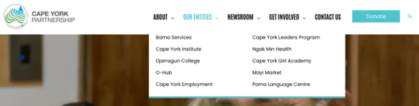
A mega menu is a two-dimension dropdown layout that allows the designer to use a large space on the screen to accommodate a number of options, usually categorising them to facilitate navigation.
A good example of a mega menu is on our website (surprise!). The goal with this menu is to allow users to navigate to any of these service pages, while showing the range of solutions and services we offer with a simple mouseover.

We used a similar approach with the Cape York Partnership website. This decision was made in conjunction with the client during the information architecture phase. As the organisation is constantly growing and adding new entities, we wanted a solution that could scale while keeping a simple design approach.
Fixed navigation
In the early days of web design, the number of screen sizes was limited. That allowed designers and developers to build websites that fit the screen vertically and horizontally. With that design, users were able to reach the navigation or footer without having to scroll or keeping it to a minimum.
With the myriad of screen sizes available nowadays, scrolling has become a natural action when users are browsing a website. In some cases, this could affect user experience as users want to navigate to other pages.
There are a couple of solutions available for this. One of them is having a “back to top” icon, which usually floats in a corner of the screen. The other one is having a fixed, or sticky navigation bar which allows users to navigate the site without returning to the top of the screen.
We use a variation of this pattern by implementing an “invisible fixed header” which displays the navigation only when the user starts to scroll back up. We made this decision to increase the vertical screen space and reduce distractions.
Footer navigation
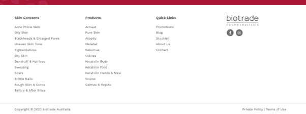
While footers tend to get much less attention than other sections of a web page, they are still scanned by users and in some cases intentionally reached as it is expected to find certain information there. The most common being contact information, social media links or a full secondary navigation menu.
For biotrade we added a full navigation menu as a way to convince users and show the full range of products they have to offer and skin concerns they cater to.
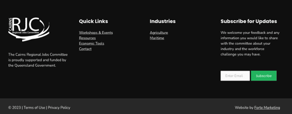
The footer also offers an opportunity to display a message that the business wants to push across the website. A good example of this is a newsletter subscription form we included on the Cairns Regional Jobs Committee website:
Related content
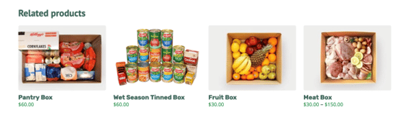
This navigation design pattern has the goal of leading users to the next relevant piece of content based on the context of the current page. And while a lot of users tend to browse a website by clicking on the navigation bar, some prefer to explore the site by following suggestions and call to actions within the site.
We have used this approach with Mayi Market to suggest similar products when users are setting up their subscription:
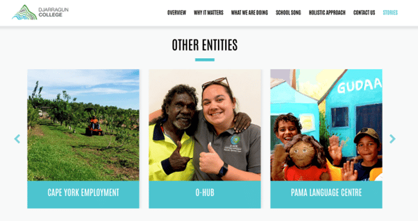
And to incentivise visitors to discover other initiatives, we included an “Other Entities” carousel that is shown at the bottom of each project within the Cape York Partnerships website:
Users visit websites to find information and it is our main goal to make that task as efficient as possible. When this is achieved, users will stay longer on the site. It will help them discover new products or services and ultimately increase the probability of converting them from users to customers. And as we all know, user experience is everything and everywhere, it doesn’t matter if it is an email, a phone call or someone visiting your website, all those touch points will add up and define how people perceive your business.
